ShopDreamUp AI ArtDreamUp

Deviation Actions


Suggested Deviants


Suggested Collections


You Might Like…


Featured in Groups


Description
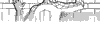
So as some of the fans know "Marvel Now" has started at the end of 2012.And this implied a change of some characters,the particular case that intrigued me was cyclops the mutant revolutionary.Im glad they didnt turn him in a villain cause that would be just stupid.The thing that hit me the most was his new costume,now as soon as i saw it I was confused but after a few days i saw it again and it realy got me interested and i was thinking to my self(well thats an awesome design)
So the first thing that came un my mind was:So cyclops has a group of x-men(aginst the law)and wolverine has one(well the "good" ones).How about a leader clash?
So the first thing that came un my mind was:So cyclops has a group of x-men(aginst the law)and wolverine has one(well the "good" ones).How about a leader clash?
Image size
1339x945px 231.43 KB
© 2013 - 2024 ArtFrenzyBoris
Comments8
Join the community to add your comment. Already a deviant? Log In
Let's talk about the major issues here: perspective and composition.
Perspective wise there is a very obvious horizon line, (the line designating the plane Wolverine and Cyclops are standing on) but none of the lines on the buildings or curves on the characters appear to pay it any mind. There is no clear vanishing point that the building's lines converge towards. They appear leaning or curved in a way that suggest the street pattern doesn't use conventional parallel and perpendicular design. The one on the far right appears to be falling down. None of the curves on the character respond properly to the horizon line. Curves below it should go downward while those above it go upward. I'm not sure if this is because of a lack of perspective knowledge or a willing ignorance of it, but perspective is essential for most arts (especially comics) and it is not difficult to understand and learn.
The composition has a lot of inactivated negative space floating in the upper left portion of the page; weighing the image down towards the lower right. This piece is need of some desperate cropping, but more importantly it would have been more visually impacting if the characters were larger, and the buildings converged in a way that moves the viewer's eyes towards Cyclops.
Finally Wolverine looks frightened in this image. I'm not sure if that's what you were going for, but it seems out of character. Turning Wolverine in a way that we could see his expression, perhaps giving him a more aggressive pose making Cyclops look more serious (he almost looks like he's smirking) could give this piece that "dynamic showdown" feeling.